
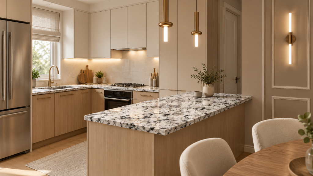
Soft white and warm cream are strong starting points for granite colors for small kitchens. Pale gray suits cooler finishes, while a quiet black slab adds definition beside light cabinetry.
The choice depends on how the whole room reads. You want stone with character, without every surface competing for your attention.
Look at the color beside your cabinets, then check the movement across the full slab. You can judge the finished effect before the stone reaches your kitchen.
The Best Granite Colors for Small Kitchens
Start with the color that works beside the finishes you plan to keep. A granite slab may have a pale background and dark flecks, or a warm base threaded with cooler minerals. Those smaller colors affect the pairing, too.
Soft white. White granite gives the counter a light base without the flatness of a solid white surface. Fine gray flecks or gentle mineral movement bring depth to a compact room.
Pair it with painted cabinetry when you want the counter to stay light while showing some character. Check the undertone carefully: a cool slab beside a creamy cabinet can make the cabinet look more yellow.
Warm cream. Cream granite sits comfortably beside oak and other warm wood finishes. It lets you keep that warmth without adding a dark surface above the cabinets.
Look for a slab with a cream background and restrained brown or gold detail. Strong rust-colored patches may pull more attention than you want, especially beside wood with visible grain.
Pale gray. A light gray slab offers a softer transition between white cabinetry and darker appliances. It works well when the room already has cool finishes.
Gray varies, though. A blue-gray base reads differently from one with warm taupe flecks.
Check the actual stone under your kitchen lighting before choosing the rest of the palette around it.
Light greige or beige. These shades connect warmer floors with cooler painted cabinets. A quieter pattern keeps the room cohesive when the surrounding materials already have texture. Avoid matching every surface too closely; a small shift in tone gives the counter enough definition to remain visible.
Quiet charcoal or black. A dark slab creates a clear line above pale cabinetry. In a compact kitchen with good daylight and a light backsplash, that contrast can feel deliberate rather than heavy.
Favor restrained movement if the room already includes patterned tile. Review the finish as well: some dark polished surfaces show fingerprints and water residue more clearly.
For a closer look at light options, explore our white granite styles for your kitchen.
Match the Slab to Your Cabinets, Light, and Backsplash
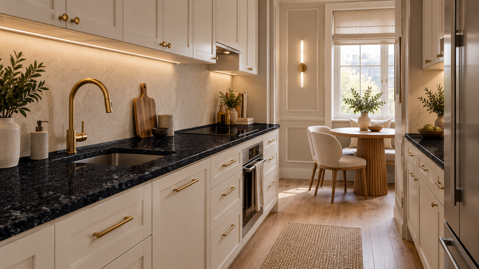
Use your cabinet finish as the first reference. It occupies a large part of the room and sits directly beside the stone.
With warm oak, a creamy granite background often creates an easy transition. Bring the actual wood sample so you can compare its amber or brown tones with the slab. A photograph may flatten those differences.
Cool white cabinets give you room for pale gray granite, but check the white paint against the stone’s background. Two whites that look similar separately can look quite different side by side.
Light cabinetry also gives a quiet black slab room to stand out. Keep the backsplash lighter if you want the counter to define the room without darkening every surface.
Look at these pairings in daylight and under your evening lights. A warm pendant can bring out gold flecks you barely noticed earlier. Under-cabinet lighting can make a polished surface more reflective, while a less reflective finish gives the stone a softer appearance.
The backsplash deserves the same attention. If the granite has sweeping movement, quieter tile leaves room to see it. If you love a patterned backsplash, choose a slab that does not compete with it at the same scale.
You are choosing the view you will see while making coffee and clearing dinner. Judge the materials together, at that distance, before deciding which one should draw your eye.
Check Pattern Scale Before You Commit to a Color
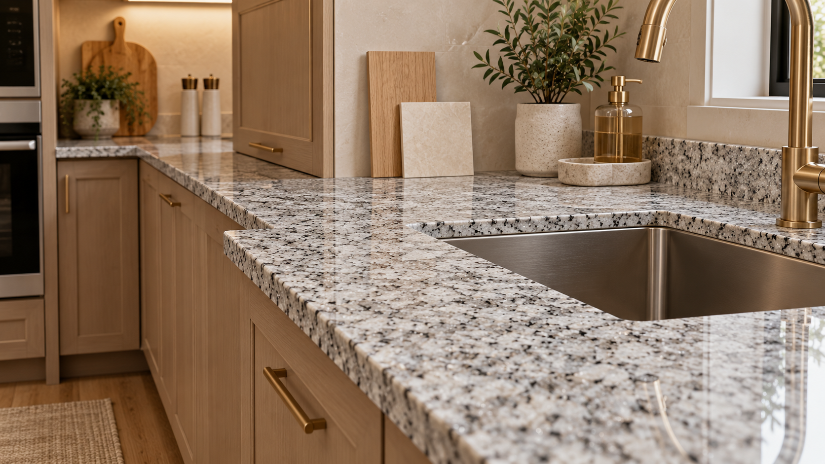
A small sample tells you about a patch of stone. It cannot show how a broad vein crosses the slab, or where a dense mineral cluster will land after cutting.
In a compact kitchen, a sink may interrupt the strongest part of the pattern. A short return can show a very different patch from the longer counter beside it. These details deserve a look before fabrication.
Use this sequence when comparing slabs:
- Step back. View the stone from roughly the distance you will see it across the kitchen. Notice whether the pattern settles into the room or demands attention everywhere.
- Bring the surrounding finishes. Place the cabinet and backsplash references beside the slab. Compare the undertones as well as the dominant color.
- Look at the pieces your layout needs. Ask which parts of the slab could appear on the longer run and near the sink. A striking full slab may look quieter once cut, or the opposite.
- Review corners and likely seams. Understand how the movement will meet where the counter changes direction. The chosen color should still feel connected across the finished layout.
Bold movement can work in a small kitchen. Give it a clear role, such as a visible peninsula, and keep nearby finishes more restrained.
Our guide to planning the slab layout before fabrication explains how those decisions carry into the finished installation.
See Your Granite Choices Together Before Fabrication
You do not need to arrive with a final color choice. Bring the cabinet finish you love and a few clear photos of the kitchen. Add your backsplash reference and a rough layout if you have them.
At Bellezza Artisan Stone Surfaces in San Antonio, we can help you compare the stone against those choices. Seeing the full slab gives you a better view of its character and how it will sit in your room.
Explore our granite countertops in San Antonio, then arrange a consultation to compare slabs for your kitchen. Make the choice while the whole design is in front of you, before the layout moves to fabrication.
Frequently Asked Questions
What Granite Colors Work Best in a Kitchen With Little Natural Light?
Soft white, cream, and pale gray are useful starting points for a kitchen with limited daylight. Their lighter backgrounds keep the counter from becoming another dark surface in the room.
Choose the undertone to suit your cabinets, then inspect the pattern. A pale slab with dense dark patches may read more heavily than expected. Task lighting also matters, so compare the stone under lighting similar to what you will use at home.
Can Black Granite Work in a Small Kitchen?
Yes. Black granite works well when the surrounding finishes give it enough contrast and the room has useful lighting. Light cabinetry and a pale backsplash keep the dark counter clearly defined.
Choose the pattern and finish with the whole room in mind. A quiet black slab may suit a compact layout better than a high-contrast pale one. Review how reflections and visible water marks appear on the finish you are considering.
Should Granite Be Lighter or Darker Than the Cabinets?
Either direction works. Lighter granite above dark cabinets creates a bright counter surface, while dark granite above pale cabinetry adds definition. Similar tones give you a gentler transition.
The better choice depends on which part of the room you want to emphasize. Check undertones before comparing lightness alone.
A cream slab can clash with cool white cabinets even though both look light. Different shades can work together when they share a warm undertone.
Is Fine-Grained Granite Better Than a Slab With Bold Movement?
Fine-grained granite is often easier to pair with busy cabinetry or patterned tile. Its smaller detail gives those other finishes room to show.
Bold movement works when you want the stone to lead the design. Review the actual slab against the layout, especially where the sink and corners interrupt the pattern. Choose the movement that looks intentional across the usable counter pieces, rather than judging the entire slab only as a large display.